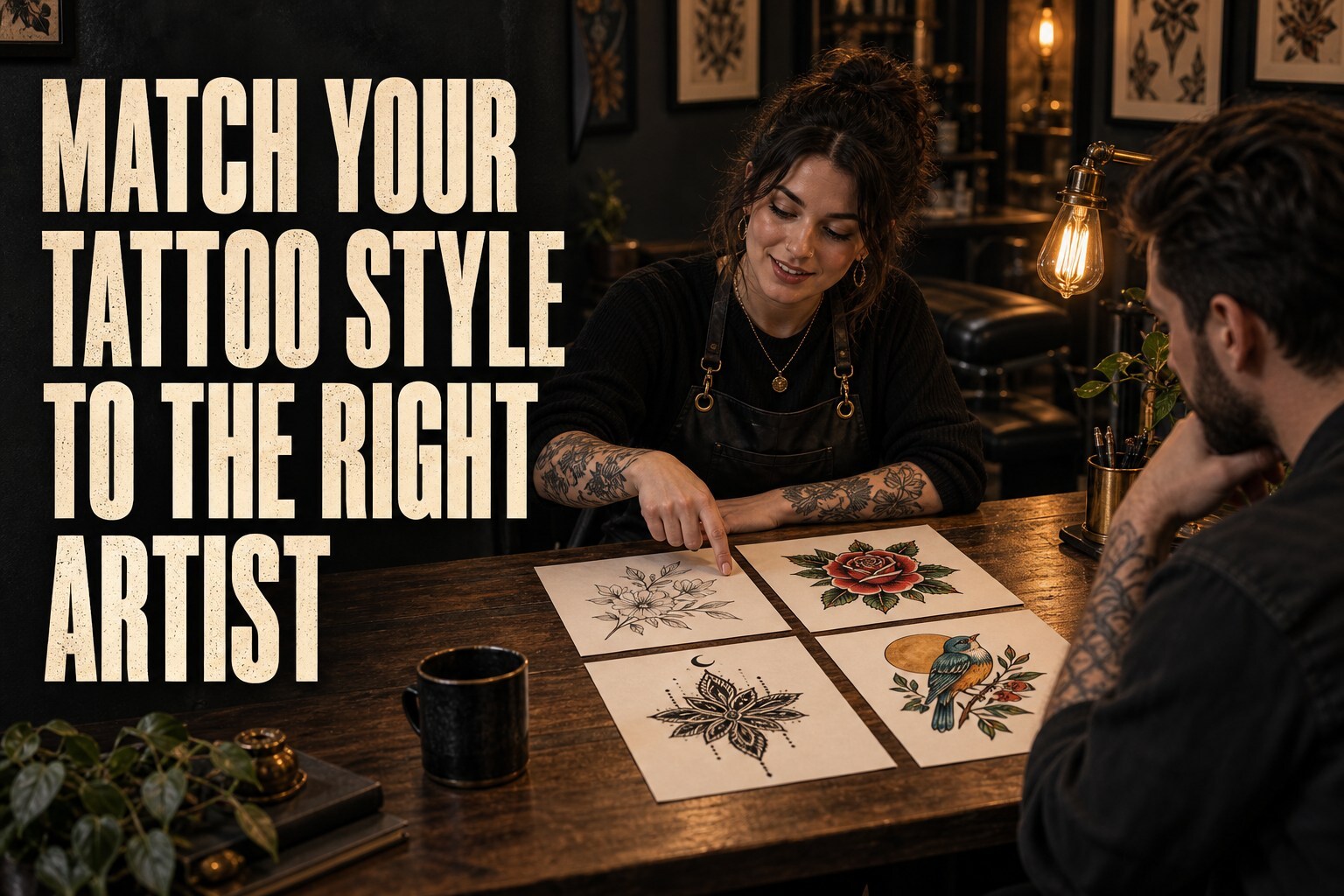
A rose can be a delicate fine-line tattoo, a bold traditional piece, a soft black-and-grey study or something bright and illustrative. The subject stays the same. The style — and the artist best suited to it — can be completely different.
That is why choosing a tattoo artist is not simply a matter of finding somebody who has tattooed the same object before. The useful question is whether their way of drawing, lining, shading and using colour matches the result you have in mind.
The short answer: match the portfolio, not just the label
Tattoo style names are helpful shorthand, but they are not strict boxes. Two artists may both describe their work as “illustrative” and produce very different tattoos. One might lean towards delicate botanicals; another might use heavy black shapes and dramatic contrast.
Start with the artist’s own work. Look for several examples that share the qualities you want, ideally at a similar scale and on a comparable area of the body. A portfolio is better evidence than a long list of style names in a bio.
Start with what you like, not tattoo jargon
You do not need to arrive at a consultation fluent in tattoo terminology. A slightly chaotic folder of references is perfectly acceptable. What helps is being able to point out why you saved each image.
- Do you like crisp outlines or softer edges?
- Do you want lots of detail or a simpler shape that reads from a distance?
- Are you drawn to solid black, black and grey, muted colour or something vibrant?
- Do you like symmetry and precision, or a looser hand-drawn feel?
- Should the tattoo feel delicate, bold, playful, dark, elegant or a bit strange in the best possible way?
Those answers give an artist far more to work with than “I think it’s sort of fine line, maybe realism, but also witchy.” Although, to be fair, we have heard less useful briefs.
What common tattoo style labels usually mean
These categories overlap, and artists use them in slightly different ways. Treat them as a starting point rather than a tattoo sorting hat.
Fine line and minimalist tattoos
Fine-line work uses slender lines and often leaves plenty of open skin around the design. Minimalist tattoos reduce an idea to its essential shapes. They can look light and elegant, but “small” does not mean every amount of detail will fit. Line spacing, placement and the natural changes that happen as a tattoo settles all matter.
If this is the look you want, study an artist’s small-scale linework closely and ask how they would simplify your reference so it remains readable.
Traditional and neo-traditional tattoos
Traditional tattooing is commonly associated with bold outlines, clear shapes and a limited, strong colour palette. Neo-traditional work often keeps that solid structure while allowing more varied colour, detail and illustration.
Look for confident line weight, clear silhouettes and colour or shading that supports the design instead of overwhelming it.
Realism and portrait work
Realism aims for a photographic or three-dimensional effect. It may be in black and grey or colour and can include portraits, animals, flowers and objects.
Here, subject-specific experience can be useful: faces, fur, reflective surfaces and tiny botanical textures ask for different decisions. Look at several relevant pieces, not one impressive photograph, and check healed examples where the artist has them.
Blackwork and illustrative tattoos
Blackwork is a broad umbrella. It can include solid black areas, ornamental patterns, graphic designs, engraving-inspired lines and dark illustrative work. “Illustrative” is equally broad and usually means the tattoo has the character of a drawing rather than a photograph.
Pay attention to how the artist balances solid areas, fine marks and negative space. Two blackwork portfolios can feel worlds apart.
Colour and watercolour-inspired tattoos
Some colour tattoos use firm outlines and carefully packed areas of pigment; others aim for a softer, painterly appearance. If colour is central to your idea, look for the kind of palette and saturation you actually want and ask to see healed colour work when available.
Skin tone, placement, scale and the chosen pigments all affect how a colour design is planned, so a consultation is much more useful than trying to judge the final result from a screen filter.
Lettering and script
Lettering is its own design job. Spacing, stroke weight, size and placement can make the difference between something clean and something difficult to read. Check the exact spelling, punctuation and language yourself before tattooing, then choose an artist whose lettering portfolio shows the finish you want.
Look past the subject when reading a portfolio
If you want a fox tattoo, it is tempting to search only for foxes. Try looking at how the artist handles fur, faces, movement, contrast and curved placements across their whole portfolio instead.
Useful things to notice include:
- whether lines are used consistently and intentionally;
- how shading moves from light to dark;
- whether small details have enough room around them;
- how the design follows the body rather than fighting it;
- whether the overall finish is consistent across several posts.
Fresh tattoos naturally look sharper and more saturated than settled ones, so healed photographs add helpful context. An artist not posting many healed images is not automatically a red flag, but it is reasonable to ask whether they have any you can see.
Size and placement are part of the style
The same drawing will not work unchanged on every body area or at every size. A design with tiny gaps may need simplifying when it is reduced. A long, flowing piece may suit a forearm or calf better than a compact round composition. Areas that bend, rub or receive more sun can also affect the advice an artist gives you.
No honest artist can guarantee exactly how a tattoo will look years from now. Line weight, spacing, placement, skin, sun exposure and aftercare all play a part. The useful sign is an artist who explains the trade-offs and suggests a version designed for your body, rather than simply saying yes to everything.
Bring references without asking for a copy
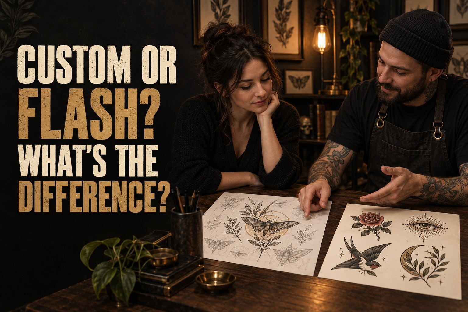
References help communicate mood, layout, colour and detail. Bring several if you can, then identify the part you like in each one. That gives your artist room to create an original design around your idea.
At The Inkpot, we will not directly reproduce another artist’s custom tattoo. Our guide to why we do not copy other artists’ tattoos exactly explains how inspiration can still become something personal and properly suited to you.
Questions worth asking in a consultation
A consultation should feel like a useful conversation, not a job interview under a very bright lamp. You could ask:
- Have you done work in this style and at this scale before?
- Which parts of my reference will translate well to skin?
- Would you change the size, placement or level of detail?
- Can I see similar pieces or healed work?
- How do you approach revisions and final design approval?
- What preparation and aftercare will this placement need?
Free consultations at The Inkpot give us time to talk through the idea, placement, size, style and budget before anybody commits to an appointment.
Safety still belongs on the checklist
Artistic fit is important, but it is not the only thing to check. In Herefordshire, both the person carrying out tattooing and the premises must be registered with the council. UK Health Security Agency guidance also stresses consistent infection-prevention and control practices because poor tattooing practice can create infection risks, including blood-borne viruses. You can read the current UKHSA tattooing and body-piercing guidance for more detail.
A professional studio should be comfortable answering sensible questions about registration, hygiene, single-use items, cleaning and aftercare. Pressure to book quickly, vague answers or an unwillingness to show the artist’s own work are good reasons to pause.
What if your preferred artist is not the right fit?
Sometimes the most professional answer an artist can give is, “This is not my strongest style.” That is useful honesty, not rejection. They may suggest a different approach, recommend another artist or help you work out what needs to change.
Likewise, availability is not the same as suitability. Waiting for the person whose portfolio genuinely fits your idea is usually better than forcing the project into the first open diary slot.
A quick matching checklist
- I can describe the visual qualities I like, even if I do not know the style name.
- The artist shows several relevant examples in their own portfolio.
- Their linework, shading, colour and level of detail suit my idea.
- They explain how size and placement may change the design.
- They are open about healed results and realistic limitations.
- The artist and premises meet local registration requirements.
- I feel listened to, informed and unpressured.
Final thoughts
The right artist is not necessarily the one who has tattooed your exact subject before. It is the one whose visual language suits your idea, whose technical choices make sense for the placement, and whose communication leaves you feeling comfortable rather than rushed.
Browse with purpose, bring references, ask practical questions and leave room for professional advice. If you want a broader look at portfolios, consultations and trust, read our guide to choosing the right tattoo artist for your style.
Got a tattoo idea in mind? Book your free consultation with The Inkpot and we’ll help you turn it into something you’ll love.